In Amazon search results, your product is a thumbnail the size of a postage stamp competing against forty other postage stamps. The main image is not one factor in your click-through rate, at thumbnail size, it essentially is your click-through rate. Price and stars matter, but the eye lands on the image first.
Here is what we optimize, in rough order of impact.
1. Fill the frame properly
Amazon asks for roughly 85% frame fill; many listings float at 60%. At thumbnail size that difference is enormous, your competitor’s product is literally a third larger on screen. Crop tight. Every pixel of white margin is wasted real estate.
2. Choose the three-quarter angle
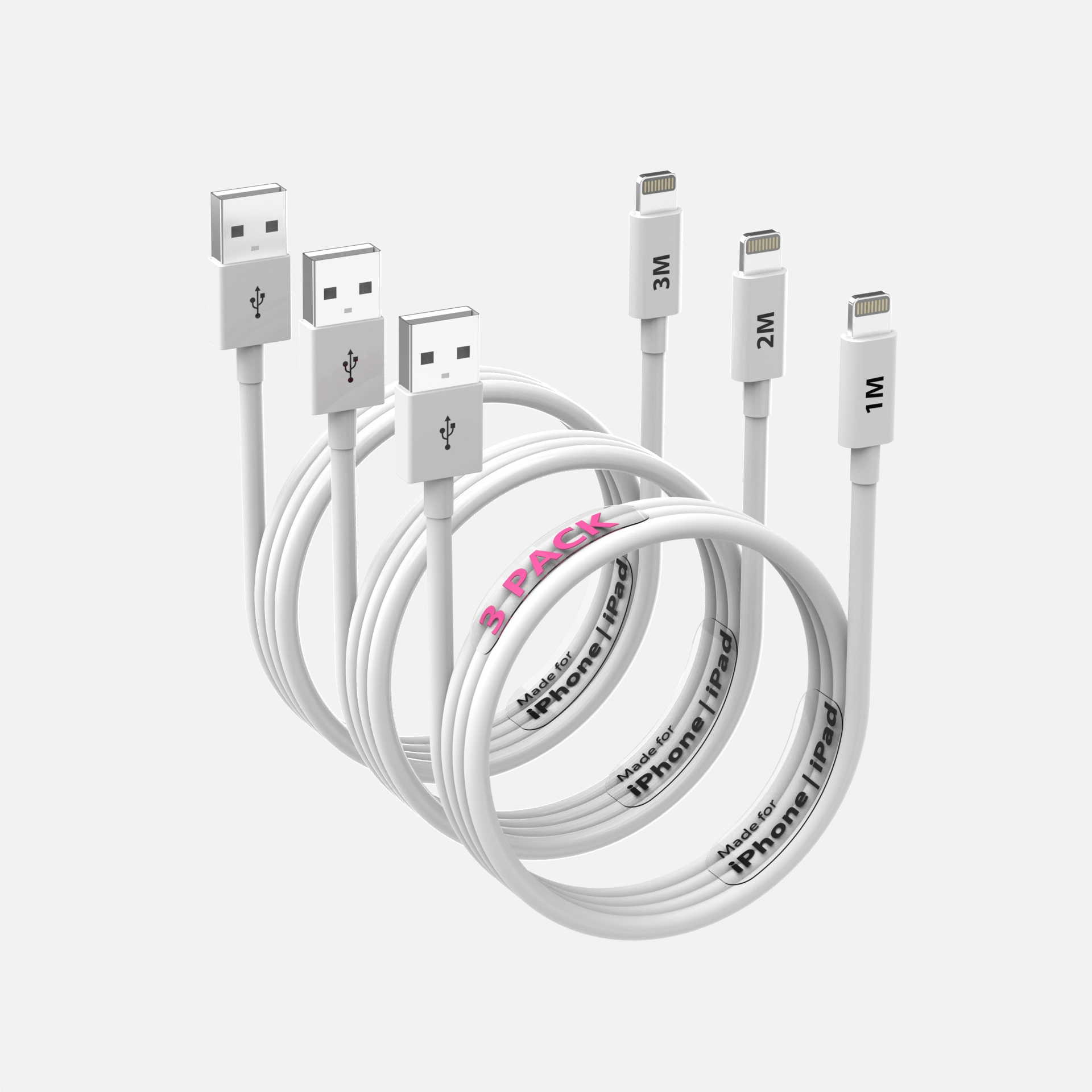
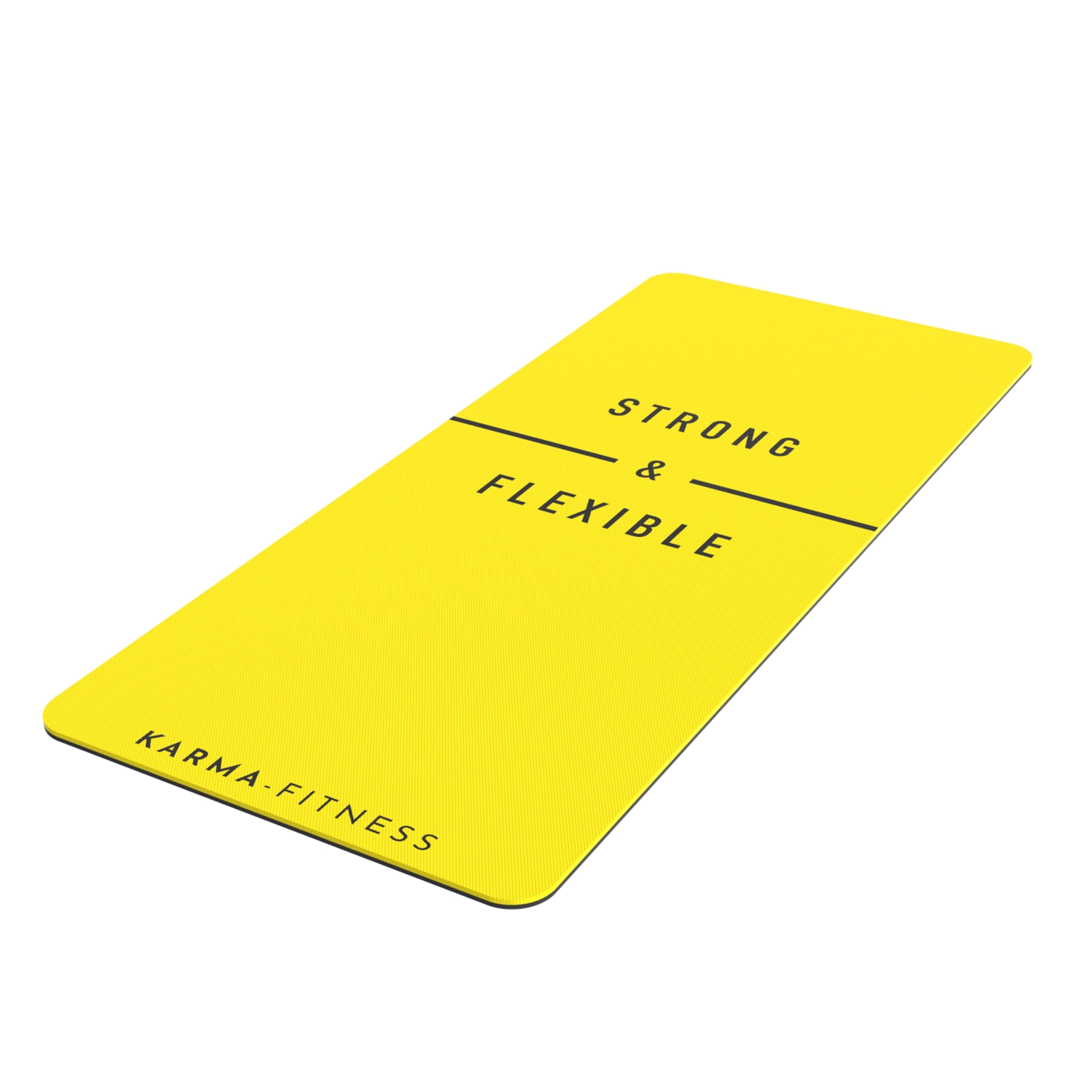
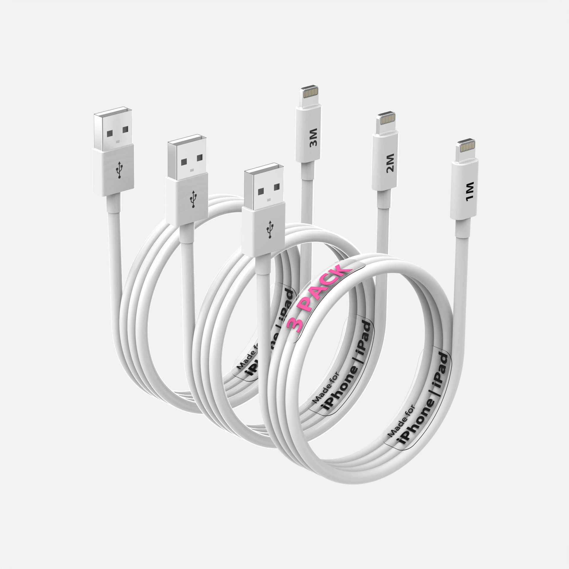
Dead-on front views flatten products into shapes. A three-quarter angle, front plus a hint of side and top, communicates depth and dimension in a single image, and it is the angle we default to for nearly every hero render unless the product demands otherwise.
3. Light for shape, not just visibility
Flat, even lighting makes products look like clip-art. Directional lighting with deliberate highlights and gradients gives surfaces form and makes materials legible, you can see that the bottle is glass and the cap is soft-touch. This is where rendering has an unfair advantage: virtual lights go exactly where the product needs them, physics of studio space be damned.
4. Engineer for contrast against white
Your image sits on Amazon’s white page. Products with pale edges dissolve into it. We manage edge contrast deliberately, slightly darker rim lighting, controlled shadows, so the silhouette stays crisp at any size.
5. Keep a readable silhouette
Squint at your thumbnail. Can you still tell what the product is? Strong, simple silhouettes survive shrinking; cluttered compositions with accessories fanned around the product turn into noise at 200 pixels.
6. Show quantity honestly and clearly
Multi-packs should read as multi-packs at a glance, a clean arrangement showing count beats a lone unit that surprises the customer later. Surprises become returns.
7. Sharpness at zoom
Shoppers who zoom are shoppers deciding. Deliver well above the 1000px minimum, and make sure label text survives magnification, soft labels quietly say "cheap product."
8. Test instead of guessing
Amazon’s built-in experiments let established sellers A/B test main images with real traffic. Where available, use it, image tests routinely produce the largest CTR swings of anything you can experiment with on a listing.
The compounding math
CTR improvements compound: more clicks feed the ranking algorithm, better rank means more impressions, more impressions mean more clicks. The main image is the cheapest lever attached to that flywheel. If yours came from the supplier’s catalog or a rushed shoot, one test render will show you the gap.
See this quality on your own product
First-time clients get a complete, high-resolution 3D render of their product for $130. Judge the quality before committing to a full package.